THE
RENSSELAEREUM
The Rensselaereum is a streetside museum created in honor of Rensselaer Polytechnic Institute’s 200th anniversary. Located in downtown Troy, within RPI’s Chasan Building, the museum features 14 windows on the north side and five sets of windows on the west side. The Rensselaereum is a collaboration between RPI’s School of Architecture and the School of Humanities, Arts, and Social Sciences.
The Typefaces

Initially, Zac Hall (RPI Architecture Class of ’24) and I were tasked with helping the architecture students create a cohesive visual identity for the exhibition. At this stage of the process, both the exhibition’s location and the topics to be displayed were still undecided. In the broadest sense, Zac took the lead in establishing the typography guidelines for the exhibit. As shown to the left, these are the final typographic rules Zac set for the exhibition.
The Logos
In the meantime, I decided to tackle a different challenge: the logo. Since the Rensselaereum originated in an architecture class, I wanted to create something inspired by the course itself. I began by reviewing notes from their discussions and sketching potential symbols. Below showcases some of my initial ideas for icons.
I was most drawn to a rough sketch of the overhead view of campus pathways. These paths are central to student life, and students rely on them every day to get to class. The architects loved the direction I was heading in and encouraged me to continue refining the design.
This process ultimately led to a more structured grid, designed in a way that allowed me to derive the entire alphabet from it. From the singular ‘R’ logo, I was able to construct the ‘Rensselaereum’ wordmark in the same style.
While the ‘R’ serves as a framework, it holds two meanings. First, it represents an arch, referencing the architectural arches at Chasan and the Student Union. Second, it functions as an arrow, symbolizing progress and RPI’s advancement into the future. Meanwhile, the wordmark includes the grid from which it was created, serving as an homage to the foundation of both the exhibition and the institution itself.


The Construction
Each window of the exhibition follows the same basic structure: a red banner, a backcloth, and a tray.
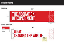
All banners follow consistent spacing rules on the north side, as shown below. Meanwhile, the west side is a bit more nuanced since the windows are narrower and arranged in sets rather than as single windows.


Image
Needed
The final element I worked on was dependent on the window’s theme. For windows like "Ace of Clubs," we reprinted all of the club cards and posters to prevent the original artifacts from being exposed to sunlight. Others were more specialized, such as the custom paint can labels for "Her-Story in the Making," which highlighted eight influential women at RPI.
Overall, this experience has been invigorating. I had the opportunity to learn and refine my graphic design skills while contributing to a meaningful project. I want to thank Professor Sara Tack for believing in me and recommending me to Professors Michael Oatman and Anthony Titus. I also want to thank Zac Hall for being my partner in creating the visual identity for the exhibit. Graeffen Anderson, Carson Oliver, and Mariah Speedling made an incredible summer team. Shoutout to the rest of the architecture class, Bokland, NoName, and the greater RPI community for making this exhibition a reality.
Each window has a customized backcloth based on the content being displayed. Most designs were already laid out by the architecture students, so my role was to construct higher-fidelity files for printing. As 2 windows shared one cloth on the North side of the building, we had to use a dividing element in between the windows. Inspired by the surveyor's stick found on the school's crest, I created a simple black and white version as to not clash with the designs of each window. Everything went smoothly until it was time to send the files to the printer. I learned the hard way that sending a high-quality PDF does not always guarantee that all elements will be visible on another machine. Since I worked primarily in Adobe Illustrator, I didn’t have the same safeguards as Adobe InDesign to ensure that all imported assets were properly linked. One frantic Friday afternoon, my professor, Sara Tack, and I had to go through all the cloth files to verify that all assets were correctly linked and then package the files before sending them off.
The trays for each window were more straightforward. Each design was applied to an AluPOLY sheet to cover the carpeting on the windowsill. The trays were customized based on the needs of each window—some were solid colors, while others extended the design of the backcloth. My favorite tray to work on was for the "Alpha to Omega" window, which showcased the history of fraternities and sororities on campus. The design was simple yet effective: a green pong table that extended onto the bottom of the backcloth, using a bit of forced perspective.


